Data-Visualization
This project is maintained by sls23
John Snow Cholera Data Visualizations
Design Process
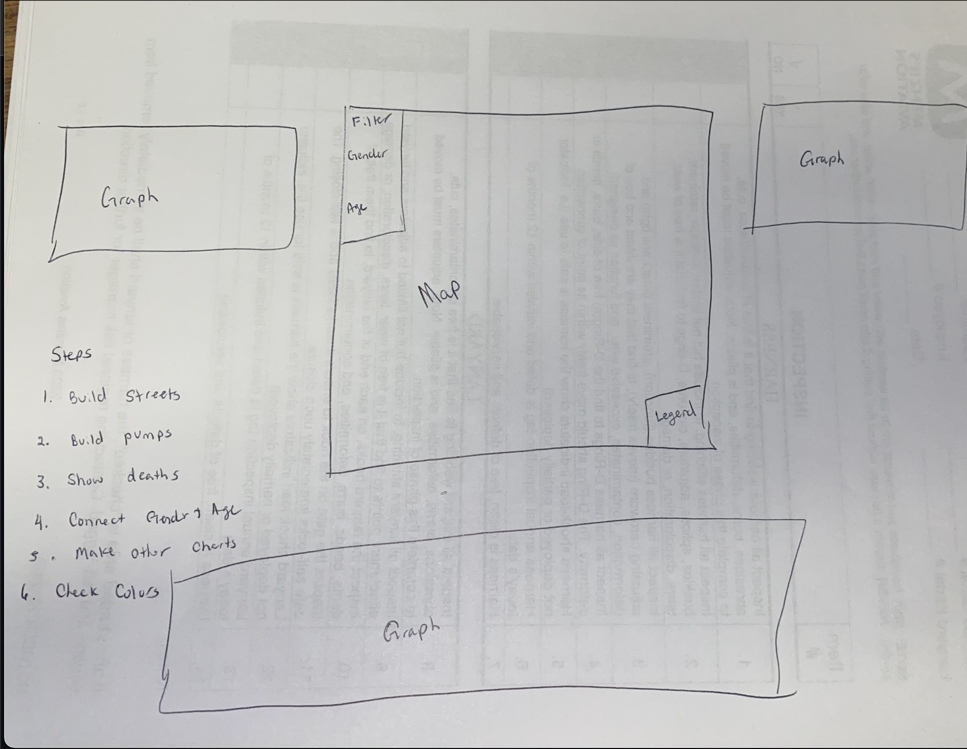
The way I began my design process was by first sketching out my ideas so that I could then have a plan set when it came to understanding the code. I set out the steps in the order I had thought I would want to proceed with.
Design Choices
I chose to create visualizations that isolated the deaths of males and females individually for comparison. To do so I had to create separate datasets. I used a colorblind simulation to run my website through before I decided on colors. I initially had males as blue, females as a light green, and the pumps as orange. When I used the colorblind simulation website I was able to see that it was very difficult to differentiate the colors. The final color selection of males being blue, females being a coral, and pumps being black allowed for all the colors to stand out. I also made sure to make the pumps much larger circles so that they are easier to see and stand out if the colors are hard to see. I chose to have the tool tip result on all bar charts to appear in the top left hand side of the visualization. I felt like this was a neutral space and easy to see and understand. Sometimes when I would hover and the output would appear over the boxes it would be hard to read or understand. The way I arranged my charts I think make the most sense. I started with the cholera map as a whole and then provided the subseqeunt maps after the whole picture was observed. I also made these maps available to see in their own window for better visualization and analysis access. I thought it would be useful to zoom into the map so that if you were curious about a particular area it would be easy to investigate. The filter I chose on the map allows you to select to see males or females as well as which age group to look at.
Cholera Map
You can explore this graph as its own web page here.
To see the visualization for the individual days and their death counnt click the link below.
You can explore this graph as its own web page here.
Male Death Count
You can explore this graph as its own web page here.
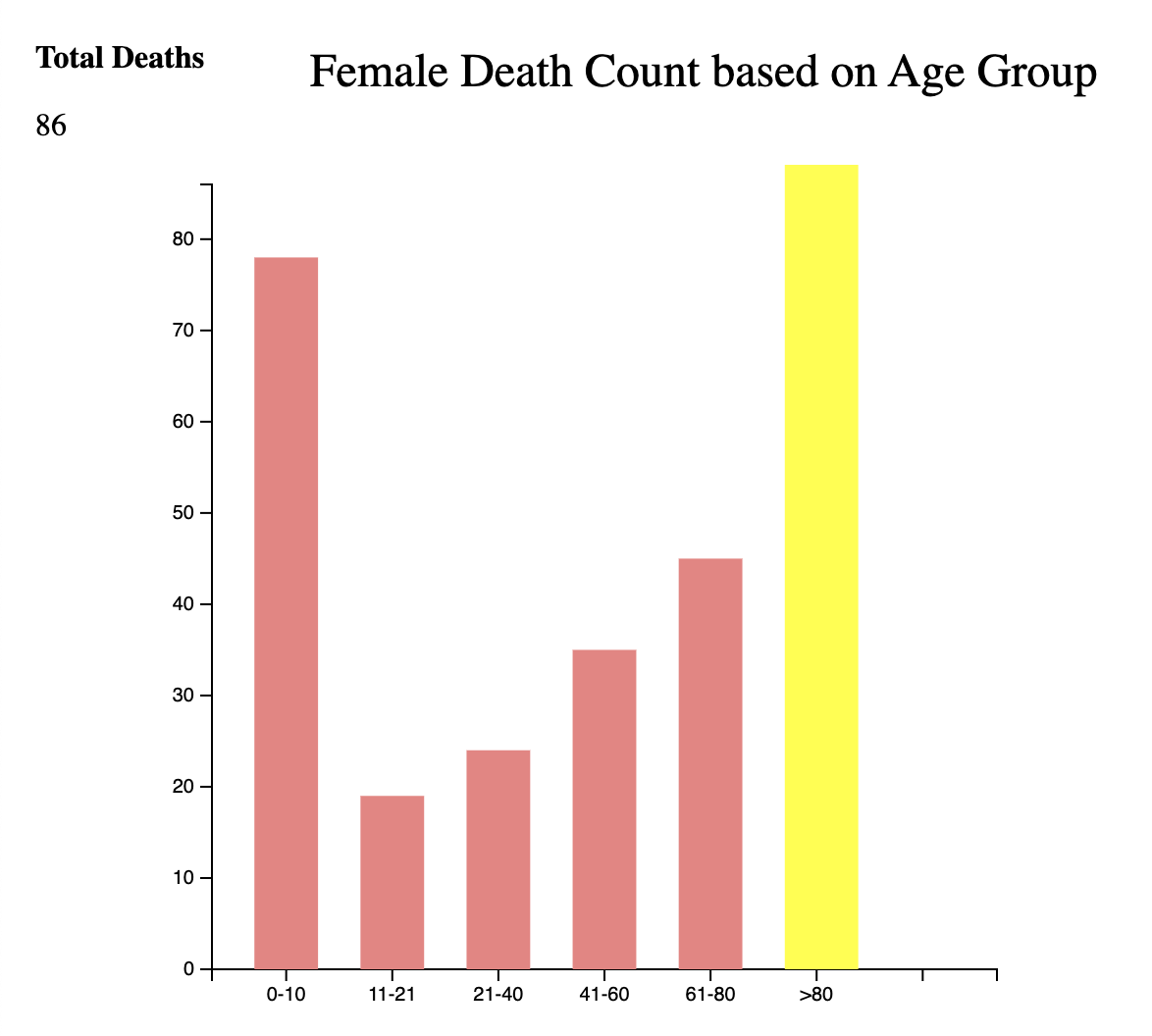
Female Death Count
You can explore this graph as its own web page here.
Facts Learned
1.The two age groups that were most effected by Cholera were the people below the age of 10 and above the age of 80. This is not surprising since those over 80 probably have weaker or comprimised immune systems and those under 10 may have no had enough time to stregthen theirs yet. 2.The difference in deaths between age groups was not vastly different between the two genders. In both cases regardless of gender the older and younger group were effected. This leads me to believe that gender was likely not a huge influence. There were 284 male deaths and 287 female deaths again not drawing major differences between the genders.

3.We can see that the days that resulted in the most deaths were August 1 and August 2. The deaths leading up to August 1 are doubled after this day. August 2 reslts in fewer deaths than the 1st but still a significantly higher number. This data could be used to see what day majority of people were infected based on when they all died.

References
List of References I used to create my map
- https://observablehq.com/@d3/d3-autotype
- https://www.d3indepth.com/zoom-and-pan/
- https://www.w3schools.com/css/css_positioning.asp
- https://www.d3-graph-gallery.com/graph/interactivity_tooltip.html
- http://using-d3js.com/04_07_ordinal_scales.html
- https://benclinkinbeard.com/d3tips/using-arrow-functions-with-d3/
- http://using-d3js.com/05_02_lines.html
- https://ishadeed.com/article/min-max-css/
List of References I used to create my barcharts
- https://www.youtube.com/watch?v=IJ8pH19qPkg&list=PLlbbWgBRF8EfU-MZNicdIGVKMIX-6krG8&index=15
List of References I used to create my website
- https://github.com/melaniewalsh/Sample-Map-Website